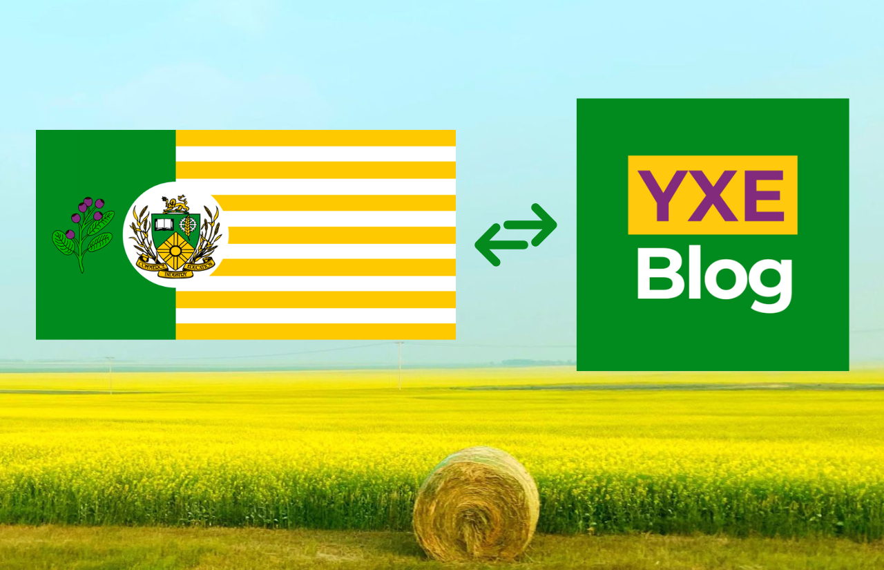
It was important that YXE Blog, a platform dedicated to celebrating the essence of Saskatoon, had a logo that would be reflective of our vibrant city. The blog’s logo, a kaleidoscope of colours inspired by the flag of Saskatoon, represents the heart and soul of the city we call home. In this post, we’ll dive into the thought process behind the creation of the YXE Blog logo and how it captures the spirit of Saskatoon.
The Colours of Saskatoon
The inspiration for the YXE Blog logo came directly from the Saskatoon flag. The flag is composed of four vibrant main colours: green, yellow, purple, and white. Each of these colours holds a unique significance, encapsulating the city’s diverse culture, rich heritage, and its bright future.
- Green: Representing Nature and Growth, the colour green symbolizes Saskatoon’s lush landscapes, thriving green spaces, and growing crops. The colour green in the YXE Blog logo reflects the city’s commitment to sustainability and environmental consciousness.
- Yellow: As you probably know, Saskatoon is one of the sunniest cities in Canada! Yellow is the colour of sunshine, and it represents optimism, happiness, and warmth. This colour mirrors the friendly and welcoming nature of the people of Saskatoon, and our close-knit communities. The yellow hue in the YXE Blog logo is a nod to the positive spirit that lives in our city.
- Purple: The colour purple not only represents the Saskatoon berry in the flag (where our city got its name), but it is also a colour long associated with royalty, which makes it a reflection of our city’s rich cultural heritage. As a city that embraces diversity and celebrates various traditions, Saskatoon boasts a vibrant tapestry of cultures. The purple shade in the YXE Blog logo embodies the city’s dedication to inclusivity and appreciation for its multicultural essence.
- White: White is a colour often associated with purity and unity. In the context of the Saskatoon flag and the YXE Blog logo, white represents the city’s unyielding commitment to fostering a harmonious community where people from all walks of life come together as one.
When combined in the YXE Blog logo, these four colours create a visually striking and meaningful representation of Saskatoon’s identity. The goal is for the YXE Blog logo to represent Saskatoon pride, paying homage to the city’s natural beauty, friendly spirit, cultural richness, and commitment to unity. It serves as a reminder of the blog’s mission of showcasing the unique aspects that make Saskatoon a great place to call home!
Welcome to YXE Blog!
